 Recently I wrote an article that advised tossing the color wheel and choosing your colors from nature.
This is especially true of decorating projects where you can be more bold in your color choices.
For home staging projects, we tend to stick to neutrals.
Some home staging clients are reluctant to paint a home they’re selling.
It’s worth pushing for it (where appropriate) because paint is the easiest, cheapest and quickest way to transform any space.
With paint and a few accessories you can transform a kitchen or bathroom from a potential buyer thinking:
“I’ll need to tear this out immediately” to “This is nice. I can live with it and renovate later.”
As you can imagine, a “tear this out” mindset dramatically lowers any potential offer on a home!
So while painting may at first appear as an unnecessary expense, it’s actually a relatively inexpensive investment in selling a home more quickly and for top dollar.
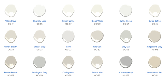
You don’t need to know the finer points of color theory to flip through the Benjamin Moore® fan deck and choose appropriate neutrals.
I use a Benjamin Moore® Design Kit to recommend colors because their paint is widely available in both the US and Canada.
If your client wants to use a less expensive brand of paint, stores like Home Depot can mix a Benjamin Moore color match in another brand working from just the color number.
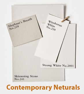
In Europe, you might consider Farrow & Ball® which has nice soft chalky colors.
Farrow & Ball organizes their neutral paints into 6 handy categories:
 Traditional Neutrals
- Contemporary Neutrals
- Red-Based Neutrals
- Yellow-Based Neutrals
- Easy Grays
- Architectural Cool
In North America, Farrow & Ball has more snob appeal than Benjamin Moore and it’s more expensive.
Now that you know more about conducting your home staging consultations, from the many previous articles I’ve written on this subject, have you thought about how you will provide color recommendations for your clients’ homes?
How I Choose Color for Home Staging Projects
I make my color recommendations at the end of the home staging consultation.
It’s easier than having to mentally switch back and forth between talking about furniture placement and color choices.
I put away my tape measure and get out my fan decks and go room to room, focusing only on what colors to use.
For home staging, I use a maximum of 4 or 5 colors, even in a large homes.
The same color looks slightly different depending on the room size and lighting. So even if you repeat the same color in multiple rooms, that won’t be obvious.
The home will look more cohesive and flow visually from one room to the next.
It’s faster and cheaper to paint with fewer colors because it’s more efficient. Especially important when you have a real estate deadline and you’re only painting to sell.
The painter won’t have to cleaning brushes and trays as often, jumping more quickly from room to room.
The prep in one room dries while he preps the next room in the same color. Then he can switch back to the first room and on and on.
Generally, I stick to fairly neutral tones for home staging, but not always.
For example, I staged a 1980s kitchen with a black and white tile floor, grey high-gloss flat cabinet doors with no hardware, and mirrored back splash.
There was no budget or time to replace the more expensive items, so I went to work with color.
We added molding and hardware to the cabinets. They were painted a light/warm olive grey, while the wall at the back of the kitchen was painted a deep clay red.
The addition of a restaurant-style blackboard created a bistro feeling and complemented the black and white floor.
(Today, I’d make different color choices, but that was in the mid-2000s.)
Home Staging Consultation Color Choices
When you first receive your full designer’s kit from a paint manufacturer, it can be very intimidating.
With a number of fan decks and over 2,000 colors to think about, many home stagers find themselves wondering, “Where do I start?”
That’s why after two years of using the kit and staging hundreds of homes, I spent several days going through it and coming up with my favorite colors to use for home staging, based on all the homes I’ve staged.
 I also grouped these 80+ colors into color palettes to make it easier to know what groups could be used to paint an entire home.
I’ve put all this and more into the Staging Diva® Ultimate Color Guide: The Easy Way to Pick Color for Home Staging Projects.
The Guide also covers:
- How and to discuss color during your home staging consultation
- What to do about ugly wallpaper
- When to use what sheen level
- What colors to use for walls, trim, floors, decks, ceilings, porches, stairs and front doors
- 15 Staging Diva Home Staging color palettes
- Specific Benjamin Moore color names and numbers (U.S. and Canadian versions)
- How to use this information when purchasing any brand of paint
- And more
How Do You Choose Home Staging Colors?
Home stagers, how do you choose colors for your home staging projects? What brand of paint do you recommend? Please share in the comments below.
Photo Credit: Benjamin Moore.
NOTE: As a home stager with a registered business, you can request your own Designer Kit from a paint manufacturer. It includes 2,000 to 3,000 colors grouped into fan decks and organized by group or collection.


I just recommended 3 new paint colors for a client’s house for staging and they LOVED the colors so much they plan to use them in their new home — but perhaps the downside is that with the new carpeting and paint colors (and a low price), there is now huge interest in the property so the owners have told me they may cancel having me stage because of the responses to the house (awful furniture and all)!
Amy, thanks for sharing! Maybe you can re-arrange the ugly furniture to make the home show even better. Your comment does wonderfully demonstrate the importance of the right colors on the walls! Thanks for sharing.
Great article!
Thanks Terri!
I’m a big fan of Benjamin More OC10 and OC12. It compliments all colors that a potential buyer may have and it pops with white woodwork but is still neutral
Fantastic Katie, thanks for sharing!