 In my last post, Choosing Paint Colors – 8 Color Moods in Decorating and Home Staging, I shared the first 4 color moods from Leatrice Eisemen’s book.
In case you missed it these were:
Tranquil, Whimsical, Nurturing and Traditional.
Here are the remaining 4 moods, and how I use them in home staging, color consultations and interior redesign.
5. Dynamic Colors – For contemporary decor
More flamboyant, dynamic colors include jewel tones like emerald.
You’ll often find dynamic colors pared with black granite, stainless steel or white marble.
Because these are so strong, I tend to use them more as accents than wall colors when home staging.
Combinations include:
- Amethyst, empire yellow, black and white
- Charcoal gray, magenta and silver
Check out this wonderfully contemporary home staging by Staging Diva Grad Red Barrinuevo.
6. Romantic Colors – Sentimental but not “cutesy”
You’ll find the romantic mood in weathered pine and wicker combined with damask or lace.
Think country living, or comfortably casual.
These shades are often muted, so they’re great for both home staging and decorating projects. A romantic combination might include:
- Birch, apricot and basil
I used romantic colors in a 19th century home I staged. It had the original wide plank floors and was once owned by Canada’s most famous prima ballerina, Karen Kain.
I confess I fell in love with that home and did all the flower arrangements in antique pitchers and vases. Although it was hundreds of home staging projects ago, I can still picture the entire house in my mind!
In the Staging Diva Ultimate Color Guide: The Easy Way to Pick Color For Home Staging Projects, I include Benjamin Moore colors like these for this group:
Nantucket Gray (HC-111), Greenmount Silk (HC-3), Odessa Pink (HC-59)
7. Sensuous Colors – Not for the faint of heart
Think robust reds, rich browns, desert camel, indigo blues, hot pinks, orange mango and spicy tones like curry and paprika. You might even throw in an animal print.
A great way to go for a master bedroom or dining room, like the one I decorated in this project which was featured in Woman’s Day Magazine.
Two of my favorite Benjamin Moore colors in this group include:
Georgian Brick (HD-50) and Dorset Gold (HC-8)
You might not choose them as paint colors for a whole wall, but they’d be great accents and could also work on a front door.
8. Contemplative Colors – Default of many stagers
In her book Colors for Your Every Mood: Discover Your True Decorating Colors, Eiseman describes this group as being most appealing to the “less is more” crowd who aren’t afraid of “monotonous monotones”.
I’m afraid too many home stagers have fallen into this group in the mistaken belief that a well staged home is so bland it will appeal to any buyer.
The danger of trying to appeal to everyone is that you become so unmemorable you don’t appeal to anyone.
Unless the neutral grays, beiges, taupes and ivories of this group are livened up with hits of deep purple, jade green, turquoise, orange or red, I think you end up with a boring backdrop that doesn’t really excite anyone.
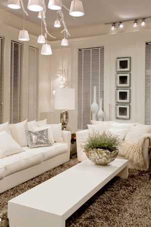
The other way to go, would be to mix it up with different textures like in the room shown at the top of this article. While largely a monochromatic scheme, visual interest is created with textures and contrasting shapes.
But then, I’m passionate about color so a room of ivory, taupe and white doesn’t really appeal to me. What do you think?
Share your home staging color opinions here
Which of these “color moods” speak to you the most?
What are your favorite colors for staging, decorating and color consultations?
Please share your thoughts in the comments below!


I totally agree with you that too many home staggers default to the contemplative colors in an effort to appeal to everyone. Of course it depends a little on the style of the home I’m staging but I always love when I get to use dynamic colors as accents. They add so much life to any room.
Thanks for commenting Peggy!
I am a good mix of dynamic and romantic when it comes to color which also speaks to my personality! In my own renovated home I chose “Funshine-Yellow” for my bedroom because it illuminates the natural sunlight that streams through the windows. And since I love water – the bathroom is a subtle turquoise which I find calming. Colors can add warmth, calm, romance and an over sense of uniqueness to any space. Got the the right mix though!
Thanks for sharing! I have enjoyed a subtle turquoise in my master bathroom too!