Home staging paint colors are one of the most important things in your home stager “tool kit.”
There are so many articles about how it’s important to neutralize a home when decorating it to sell on the real estate market.
The most common design element where you see the “neutral rule” at play is in choosing home staging paint colors.
We look at neutralizing because we have a goal of appealing to the greatest number of potential home buyers.
This advice isn’t always appropriate for home staging because we’re not trying to appeal to “everyone.”
Our goal is to help the likely target buyer of that property fall in love.
Consider the price, location, style and size of the home when forming a picture of the likely buyer in your mind.
If we think of a 5 bedroom home in a sprawling suburb, that buyer is likely to have a very different aesthetic sense than a bachelor looking for an urban loft for example.
In a suburban family home, you’ll probably stick with safer and more predictable choices when it comes to furniture and wall colors.
For the downtown loft, you might choose something bold to appeal to a younger crowd.
Neutral or Boring Paint Colors?
 There’s a fine line between “neutral” and “boring” when it comes to decorating and home staging.
I rarely paint walls white or a whole home what you might picture as “beige.
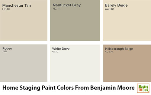
When I’m using Benjamin Moore colors, here are 6 of my favorite go-to neutrals:
HC-81 Manchester Tan
HC-111 Nantucket Gray
CC-140 Barely Beige
1534 Rodeo
OC-17 White Dove
CC-330 Hillsborough Beige
I know you’re probably wondering why I haven’t included some dull grays here. I talk about gray walls in this story.
Can you spot the subtle differences between these home staging paint colors?
For example, Hillsborough Beige has more red, while Barely Beige has more yellow. I’ve made the differences more obvious by how I’ve positioned each one in the sample swatches above.
That subtle difference from “red” to “yellow” of these two beiges will be magnified when the color covers an entire room compared to a tiny paint swatch.
Notice also in the swatches above how much more green there is in Nantucket Gray and White Dove.
I teach you how to see these differences in the Staging Diva Ultimate Color Guide: The Easy Way to Pick Color for Home Staging Projects.
Another important tip is that colors look different in different light and depending on what’s around them.
For that reason, try and finalize your color choices in the light that exists in the room it’s going in. Consider what it will look like at different times of day.
Also look at the swatch against a white or black background to really see the color.
For example, you might consider carrying a black piece of velvet in your bag to put the swatch against so you won’t be mislead by looking at it against the existing wall color.
Once you think you’ve found a choice you like, hold it up against other surfaces. How does the paint color look with the floor? Don’t just lay the paint swatch flat agains the floor (where the light will be misleading), hold it perpendicular the way it will appear on a wall.
You’ll find tons more tips like these in my Staging Diva Ultimate Color Guide.
Home Staging Paint Colors are Just the Beginning
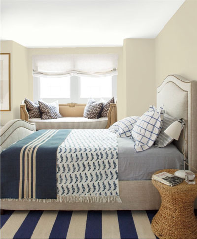
 With the paint color on the walls providing a neutral backdrop, I’ll punch up the rooms with colorful accessories like: art, vases, baskets, flowers, accent cushions, throws, table runners, placemats, bedding, shower curtains and towels.
I generally choose a signature accent color, or two, to repeat throughout the home. This makes it more visually interesting (ie: less neutral), and ties the different rooms together.
In a recent post, Toss the Color Wheel and Look To Nature for Decorating Colors, I shared the example of how Staging Diva Graduate Adam Luttrell of Shift Property Styling in Tasmania did this with turquoise accents.

Need an Easy Way to Pick Home Staging Paint Colors?
In the Staging Diva Ultimate Color Guide: The Easy Way to Pick Color for Home Staging Projects, I walk you through how I incorporate a color consultation into my home staging consultations.
In addition to 30 color tips, you’ll get 85 of my favorite home staging colors and when to use them on walls, trim, ceilings, floors, doors and more.
You’ll save time and feel much more confident with the 15 ready-made color palettes I share, plus you’ll learn how to create your own groupings.
Here’s what California home stager Ofelia Doherty says about the Staging Diva Ultimate Color Guide:
“This guide cuts down the overwhelming choices for colors and gets down to what really works for staging. Great info on how to introduce wall color to clients who can be resistant to change. Debra gives you step-by-step information on how to suggest the best possible solution to attract the greatest number of buyers.” Ofelia Doherty (CA)
Share Your Favorite Home Staging Paint Colors
Home Stagers, what are your top picks for home staging paint colors? Do you have any other tips to share for how to choose or use them? Please share in the comments below.

I like Repose Grey and Silver Mist from Sherwin Williams.
Those are great Connie, thanks for sharing!
I like Sherwin Williams Accessible Beige, which is a greige color that seems to go magically with everything.
great thanks for sharing