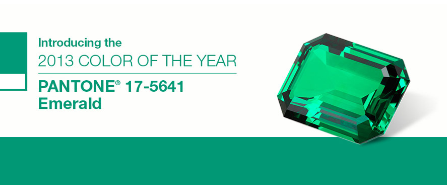
 Home stagers, it’s official, Pantone has selected Emerald as their color of the year.
I must admit I like the freshness of it and can totally see it as an accent color that splashes through different rooms in one of my next home staging projects.
I’ve never been one of those home stagers who believes everything has to be totally neutral when you’re decorating a house to sell.
After all you’re also trying to stand out from the competition of other homes in a similar location and price range that are on the real estate market at the same time.
Careful addition of color is one way to make a home staging project memorable
Now I wouldn’t paint a wall emerald, but I can see it being a great choice for towels, accent pillows and throws. It would also be great to have some decorative objects or artwork that incorporate this color.
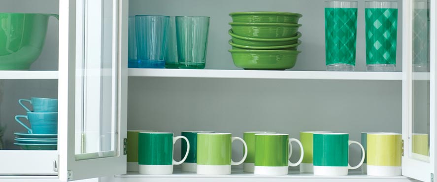
It also pairs nicely with turquoise, yellow, blue or gray as suggested in this lovely array of dishes and mugs from the Pantone website.
What is Pantone anyway?
Have you ever wondered why a color suddenly pops up in everything from graphic design to makeup, packaging, home decor, fashion and other industries all at the same time?
It’s no coincidence! The next “in” colors are chosen way in advance and all the key industries know about it.
Once the general public gets the announcement, the color is all over the place already because of the significant lead times these industries work with.
I’ve loved Pantone colors since my first days in advertising and communications.
I first heard about them in relation to matching logo colors when I worked in packaged goods. Pantone was a way to specify precise colors for printing and it’s something that big companies pay tremendous attention to.
Think how weird it would be if “Starbucks Green” or “Red Cross Red” looked different when it appeared on a truck, magazine ad or sign? It just wouldn’t look right!
The Pantone color matching system allows consistency no matter where a color appears.
If you want tips for using color in home staging, be sure to check out the Staging Diva Ultimate Color Guide: The Easy Way to Pick Color For Home Staging Projects.
How would you use emerald in home staging?
Would you consider emerald for your next home staging project, interior redesign or color consulting project? It would be great if you’d share specific paint color names and numbers you’d like to pair it with. I know that will help and inspire our community.
Please share your thoughts in the comments below!


On the use of vibrant accent colors, I have used the Benjamin Moore 741 San Jose Blue as an accent color for one wall on 2 of my redesign projects. As an accent wall in an office paired with light grey. It gave the office a more actual look, energized the space yet looked classy. And in a children’s room. It made that little space so much more interesting and pleasant ! Both clients were very happy even though they had never worked with accent colored wall before !
Fantastic Francoise, thanks for sharing these ideas.
Great article Debra. Early on I came upon an emerald green/other greens striped bedding set on clearance, which I have paired several times with red and black pillows and throw to rave reviews. It helped I also to have a pair of large pictures of large white orchids with prominent emerald green leaves, all against a black background. Stunning.
Wonderful Patricia, thanks so much for commenting!
I would definitely use it in staging projects! Emerald green will be everywhere this year…buyers are looking for new, fresh and modern.
“Sprinkle” staged spaces with pillows, vases and other accessories in emerald for a “hot” look…
Dawn, I agree a “sprinkles” of emerald will be very strong!