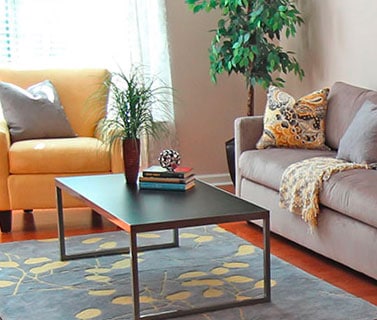
 Few home stagers are able to shoot home staging photos that look as good as what a professional photographer would create.
We don’t have their experience or expensive equipment.
That said, the cameras on our phones are getting pretty sophisticated.
Plus, there are so many online apps and computer programs to help you adjust your photos to make them portfolio-worthy.
Especially, when you’re just starting out.
Home Staging Photos Get Better With Practice
The home staging portfolio you use to get your first projects will improve over time. Eventually, you’ll have more home staging jobs to pull from.
Plus, many of the real estate agents will hire a professional photographer for their MLS photos. You can request permission to use their “after” photos.
In the meantime, let’s look at what can be done to fix the home staging photos you’ve taken on your own.
These might have been taken in your own house, which is an excellent way to start your home staging portfolio.
Here’s an example of the various steps of retouching an existing image. Notice how you can use the same home staging photos in very different ways.
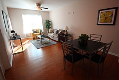
The original shot was way too dark in the foreground because of the bright window. This problem could have been avoided by letting the camera focus using the available light near the dining room table instead.
But we can still fix the lighting quite a bit.
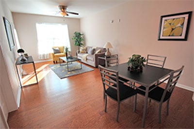
This is a much better home staging portfolio photo already. When you’re showing the transformation of a vacant room you may want to show the whole living room/dining room area as shown above.
Cropping For More Interesting Photos
We can play with the way the home staging photo is cropped. This draws the eye to more important details (depending on the point we’re trying to make in the photo itself).

Notice, I’m still keeping the final photo at the same width. With the tighter cropping shown above, it’s a more dynamic home staging photo.
With this cropping the photo better showcases the home stager’s talent and eye for detail.
You can also use your same original photo to create very different vignettes, as shown below:
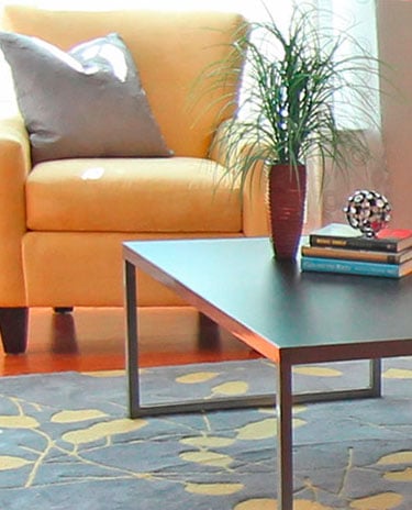
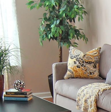
So as we’ve seen, if your original photo is too dark, or doesn’t highlight the most important details, there is a lot you can do. Retouch it on your computer or in an app on your phone.
These techniques will also allow you to radically expand your home staging portfolio. Giving you more photos from the same room to use on different pages of your home staging website.
What to Use to Edit Your Photos
In the early days of my advertising career in the 1980s, photo retouching was done on a machine larger than my entire home office. The process could cost thousands of dollars for retouching a single image!
Image editing software has come so far and continues to go down in price. I’m amazed at how much you can do just with the tools built into an iPhone!
In this demo, I created 4 effective home staging photos from a single dark original shot. I used Adobe Photoshop on my laptop, and played with the setting for Shadows/Highlights and used the Crop Tool.
I also rotated the photo 3 degrees clockwise. Simple as that!
Now Adobe Photoshop is a more complicated program than you need. If the photo is on your computer, you can use an online service like PicMonkey or Canva.
If the photo is on your phone, try the editing functions that are built right in. Or use an app like Snapseed.
Special thanks to Staging Diva Grad Kate Perry of Accents and Amenities LLC (PA) for sharing the original home staging photo for this demo.
This is the first step-by-step photo post I’ve done, and I’d really appreciate your feedback.
Let me know in the comments section if you’ve found this photo series helpful in re-imagining your own home staging portfolio.
Your comments also help me with ideas for future articles.
I cover photo retouching steps in more detail in the best-selling Staging Diva Ultimate Portfolio Guide: Winning Clients With The Perfect Home Staging Portfolio.


Thank you Debra for using my photo to show your editing tips and techniques. I’ve been working on building and improving my portfolio and all of your input is greatly appreciated!
You are most welcome Kate! Feel free to use the new photos I created for you in your marketing. After all, it’s your work I was working from 🙂
Thank you, Debra, for the tips on turning a dark photo into something usable. I am eager to see what I can do with some of my photos that didn’t turn out so great the first time around.
Fantastic Kim, glad I could help. Thanks for commenting!
This post was a great reminder and a wonderful step by step instruction for how to salvage some of our photos. This happens; especially when you find that the outside light is not the best when you finally get staging done inside. Great job, Kate. I love the clean, simple lines in your staging decor and with light adjustment – wow!
Thanks for leading us again, Debra!
You’re the best Stacy, thanks for commenting!!!
My photos are amazing before and afters of my home for my first portfolio. They look clear on my phone but they look fuzzy on the website? I do have an older phone.
Patty, one reason they look better on your phone is that they’re smaller than when you look on your website. It comes down to the size and resolution. For example, if you’re making a photo larger than the original, it will become pixelated (aka fuzzy). That said, the resolution from your phone should be fairly high, so it’s about HOW you’re resizing things.
I explain in detail how to solve this issue (and many more) in the Staging Diva Ultimate Portfolio Guide.