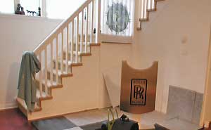
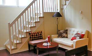
Today is the fourth and final photography tip for home stagers for this series of blog posts. Today’s tip will prevent you from having to spend hours poring over your photographs trying to put together before and after pairs that demonstrate your strength as a home stager.
When you’re putting together your home staging portfolio, you have no room there to add average pictures. Your shots have to demonstrate your talent and ability. Before you ever start shooting, you should have this in mind.
Today’s photography tip for home stagers is:
Find a strong staging story. When you take your before shots, consider which ones will make the best staging story. Make notes of the spaces you’ve photographed and after you’re done, capture the ones that speak loudest of your abilities.
 Have you added some colorful accessories, a piece of art and a paint color that ties a room together beautifully? Be sure that’s demonstrated in your photos and use this type of shot in your marketing. You want to have a story for your captions.
If you’ve de-cluttered a room but all that’s in it is a bed and a lamp for the after shot, this doesn’t belong in your portfolio.
In a kitchen, if the only change is that you took the clutter off the counter tops and turned the lights on, this doesn’t belong in a portfolio either because it doesn’t sell your abilities. You want to dazzle people, so go for strong shots that will do this for you when you’re not there to explain what you did in each room! 
Remember too that a transformation that is dramatic in person, may be less so in your photographs. So you really need to analyze your shots to ensure they’re as strong as they should be.
The act of staging alone will improve the look of a home, and will provide decent before and after shots. But paying special attention to the tips in this series of blog posts will help to ensure you’re putting your best foot forward with your portfolio.
If you’d like to catch up on the previous three posts in this series, here’s a link to the first which was about thinking before you take your photo, the second with some digital camera basics and the third post where I talked about attention to detail.
Please add your comments by clicking the link below. I would love it if you would add to this conversation!

Debra Gould, The Staging Diva®
President, Six Elements Inc. Home Staging
Home Staging expert Debra Gould also known as The Staging Diva knows how to make money as a home stager and is determined to inspire and teach others to do the same. There are over 1000 Staging Diva Graduates who have learned to use their decorating talents and run their own home staging business in the Staging Diva Home Staging Business Training Program.
[tags] Staging Diva, home staging, home staging business, home staging training, staging, stager, Debra Gould, photography tips, home staging photos, before and after photo tips, home staging portfolio[/tags]

Is it better to turn off light when you take a picture, I don/t really use a flash because I prefer to adjust the aperture and the shutter speed with the ISO and WB. Sometimes some rooms don’t have windows or it could be cloudy outside and I need to shoot. What do you think?
Thanks
Christine, I usually shoot with the lights on. I don’t use a flash either because I don’t like what it does to the colors. Also on my camera, the wide angle lens attachment blocks the flash anyway.
Debra
I difficult problem I have is choosing wall colors when the trim is medium/yellowish natural wood. Beiges and greys look drab because there is little contrast. Same with medium tone colors. Of course darks are out for staging mostly. Is white or cream the only option?
Great question Cathy! I’ll address this in a separate blog post.
Would love it if you email me a photo of a sample room to use with my article. If you do, please say in subject line, “photo for staging diva blog” and then repeat your question in the email.
We get hundreds of emails every day and that will alert me that we had this little interaction in my blog here and remind me to follow up with a new color article on this staging dilemma. Will also invite comments in my posts from other stagers with their recommendations.
Thanks for writing!