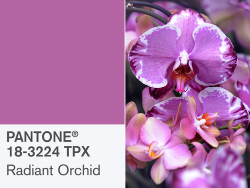
 Every year the Pantone Institute™ chooses the Color of The Year. For 2014, it’s Radiant Orchid.
Great for cosmetics and clothing perhaps, but not my favorite for home staging.
My first reaction was that it reminded me a bit of that dusty rose that was so popular in the 1980s.
Thankfully Radiant Orchid is more vibrant and has more purple in it.
It’s no coincidence that you’ll see Radiant Orchid popping up in all kinds of products in 2014. Manufacturers worldwide knew this would be the color of the year quite some time ago.
The rest of us only find out when the Pantone Institute issues their press release at the end of December – just ahead of all that merchandise hitting the stores.
How to Stage Homes with Radiant Orchid
Since it’s in the purple family with pink undertones, Radiant Orchid will pair nicely with charcoal gray in a dynamic color scheme. I can also imagine it working very well with chocolate brown, blue or green.
I wouldn’t use it as a wall color (except perhaps in a tiny powder room for extra drama).
Can’t you just imagine it as an accent color in home staging accessories like bedding, shower curtains, towels, throw cushions, or vases?
Or you can keep it really simple and just include an actual orchid in your home staging scheme.
I’ve used orchids successfully in dining rooms, master bedrooms and bathrooms. When you’re using flowers for home staging, you need something that lasts fairly long and doesn’t need a lot of care.
If you want tips for using color in home staging, be sure to check out the Staging Diva Ultimate Color Guide: The Easy Way to Pick Color For Home Staging Projects.

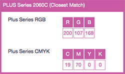
To use Radiant Orchid on your website, use the HEX Code: B163A3.
See the attached chart for how you’ll match it in RGB (online) or CMYK (printing).
According to Pantone Executive Director Leatrice Eisemen,
“Radiant Orchid encourages us to innovate.
Purple draws you in and speaks to creativity. It’s a magical color of beguiling charm.”
Perhaps this means we’ll see it on the red carpet come Oscar night. Radiant Orchid is quite feminine and I can totally imagine a few starlets dressed in ball gowns of this color.
Since it’s so feminine, I wouldn’t go overboard using Radiant Orchid to stage homes. What do you think? How would you use Radiant Orchid for your home staging clients?
Please share your thoughts in the comments below!


I personally think it would look great with grays, for interior redesign projects, in ‘her’ home office or a guest room. However, for staging I don’t think it would work with the color palette most people have here in Texas. We do predominantly Tuscan colors, reds and oranges more than the grays and cool colors.
Noleen, I love the Tuscan colors and agree with you completely. Thanks for sharing your thoughts!
I recently painted my white kitchen in BM Chelsea Gray, my accent colours are orchid. I took photos of close ups of my flower gardens and framed them in white frames with Chelsea Gray mats, they look amazing against the gray walls!!! All white curtains with orchid throw cushions on my dining room chairs. It looks fabulous!!
Christine, that sounds gorgeous! And how “on trend” you are!! Would love to see a photo, please post to my Facebook wall at:
http://www.facebook.com/TheStagingDiva
Thanks for sharing!
Soft purples have definitely always spurred the feminine senses; however, pairing orchid with cream and black (especially in geometric patterns/textures) is a knock-out. I’ve used Victorian Mauve with black and earthy taupes and it looks subttle and fabulous!
Darby, that sounds yummy! I’m so excited about your comment as well as the others who have shared color ideas/experiences. It’s reminded me how much I love playing with colors and envisioning them together. I can tell you do too. Thanks for commenting!
I have used it as an accent in staging (an orchid and some hand towels in a powder room) but with a lot of white.
Thanks Avril!
Yes I agree with Debra, it is a feminine colour but I have see men wear this colour shirt with a grey suit and it looks brilliant. I have also used it in my powder room with a touch of light blue and it looks beautiful!! Now when it comes to staging, one has to be careful because if used too much, this colour can be overpowering. I would use it in my accesories when staging a masterbedroom. It is also a beautiful colour to use with dark purple when staging a baby girl’s nursery.
Sally, thanks for your comments. I just LOVE your idea of combining this with dark purple for a girl’s room! That would be gorgeous!