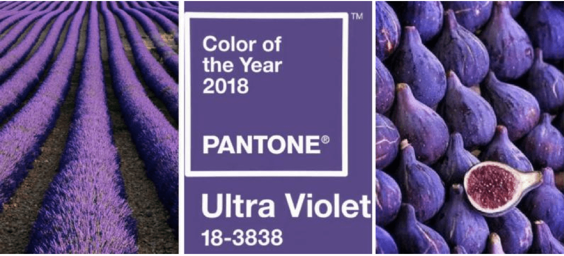
 Home stagers, it’s official, Pantone has selected Ultra Violet — otherwise known as purple — as their color of the year for 2018. It just so happens that this is an incredible home staging accent color!
I can’t tell you how much more I like this choice than when Radiant Orchid was all the rage!
Actually I like this choice for the same reasons I liked another jewel tone, Emerald, which they chose in 2013.
If you’re wondering what Pantone is, or whether they will have any influence, I wrote about it in more detail here.
For now, suffice to say that Pantone’s choice means you’ll be seeing purple popping up all over the place in 2018.
In textiles, home furnishings, cosmetics, home accessories, jewlery, fashion, etc. The official color number from Pantone is 18-3838, which is handy to know, especially if you’re thinking of using it in your home staging business logo.
Purple is often associated with mindfulness and spirituality which is why you’ll often see it in yoga and mediation centers. It’s also associated with experimentation and non conformity. Think Prince, David Bowie and Jimi Hendrix 🙂
Here’s a video about ultra violet and the places you’ll see it pop up in 2018:
Home Stagers Use Purple This Way
Purple is a refreshing choice that will add spice and brightness to otherwise neutral decor. It will work well as an accent color that splashes through different rooms in your upcoming home staging projects.
I wouldn’t use ultra violet as a paint color in a home staging project because it’s too bold and might scare off home buyers.
However, there are many ways to incorporate purple in a less overbearing way. For example through: art, flowers, vases, lamps, decorative objects, accent pillows, throws, towels, perhaps even bedding (especially in a kid’s room).
Consider the importance of color repetition to establish a cohesive look in a home.
You can sprinkle small hits of purple across different rooms, to pull it all together. Here’s an article about how one Staging Diva Grad used turquoise in that way.
On the other hand, if you’ve got a color consultation or interior redesign project, you may want to consider purple. Imagine a tiny jewel box of a powder room painted ultra-violet top to bottom, with white fixtures and white (or gray) fluffy towels! You can definitely be bolder when you’re not choosing paint colors for home staging.
I used ultra-violet tile for the backsplash of a kitchen I renovated in my own home in 1996. I really wish I still had photos of it to show you! I have to admit, that’s not something I would do today.
Home Stagers Will You Use Purple?
Please share in the comments whether you are planning to use purple in your home staging projects. Also what colors do you think it will pair well with?
If you’d like me to write an article about how you used purple in a home staging project, you can submit your photos and details here.


