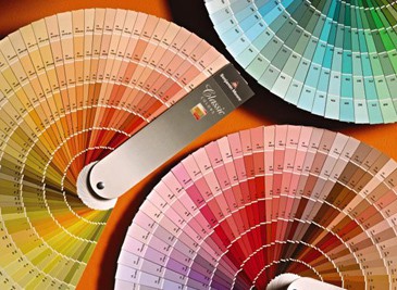
 Choosing paint colors is something so many of our clients have trouble with.
How many times have you gone to someone’s home and seen a bunch of swatches stuck to their walls?
One reason I’ve loved decorating since I was a little girl is that I’ve always been passionate about color.
There was nothing so magical to me as a brand new box of Crayola crayons.
To this day, just flipping through color swatches energizes me.
I love how Leatrice Eisemen, describes what color does in her book, Colors for Your Every Mood: Discover Your True Decorating Colors.
“There are limitless tints and tones to calm or excite you, elevate or depress you, warm you or cool you, and even stimulate your appetite. There is the irresistible influence of color that tugs at you and appeals to your emotions, often on a very visceral or subliminal level. ” – Leatrice Eiseman
Past executive director of the Pantone Color Institute, Eiseman defines 8 color moods in her book Colors for Your Every Mood which may help you in choosing paint colors.
Here they are along with how I use them for home staging, color consultations and decorating projects.
1. Tranquil Colors – Think sand, sea or nature
Cool, clear, light to mid-tone shades of clear greens, misty aquas, soft blues, cool mauves, pristine whites and vaporous grays. Tranquil combinations might include:
- Spa blue, orchid ice and gray mist
Because these colors are so restful they are great for creating a spa-like atmosphere in a bathroom or when decorating or staging a bedroom.
2. Whimsical Colors – Fun, free spirited and joyful
Bright hues in all the color families — warm reds, cheery oranges, smiling yellows, electric blues, hot purples and gumdrop greens. Whimsical combinations might include:
- Bright rose, snow white and blarney green
- Strong blue, grass green and daffodil
While these might not be ideal for home staging in terms of wall colors, you can certainly feature whimsical colors in room accents like accent cushions, artwork and kids bedding.
I used these extensively in the Whimsical grouping of the Debra Gould Home Collection, back when I was designing and painting floor cloths, mirror frames, clocks and other accessories.
3. Nurturing Colors – Gentle like a baby blanket
Here’s where you’ll find the “tender tints” like pastels and the softest yellow, peach or melon. Perfect for decorating or home staging a nursery or girl’s bedroom.
In the Staging Diva Ultimate Color Guide, I used Benjamin Moore colors like these:
Hancock Green (HC-117) and Windham Cream (HC-6).
4. Traditional Colors – More formal and often heavy
My least favorite color group because I find it dated (though many would say these stand the test of time). Hunter green just screams 1970 to me. I usually paint over dark wood trim, so “traditional” really isn’t my style!
Especially popular for formal living rooms and dining rooms.Traditional combinations include:
- Tapestry green, antique gold and claret red
- Eggplant, spruce and taupe
These colors don’t always have to be used in a traditional way. Check out how I used eggplant in this funky kitchen makeover, featured in Woman’s Day Magazine.
In my next post I’ll cover the next 4 color moods: Dynamic, Romantic, Sensuous and Contemplative.
Until then, what do you think? Do you have trouble choosing paint colors? Which of these “color moods” speak to you the most? Please share your thoughts in the comments below.


Debra, I don’t think colour is a key strength of mine – but I’ve definitely improved since becoming a stager. One website that has helped is Design Seeds http://design-seeds.com You can search by colour value or by theme (e.g. summer, vintage or global) for hundreds of different palettes that ‘just work’ and with really interesting colour combinations. I often take a screen shot to the furniture warehouse for reference of the look/feel that I’m after.
I think the more you play with color, the more confident you get. When I say “play” that doesn’t only have to mean actually putting paint on a wall, it can even mean flipping through swatches and making groupings of 3 or 4 colors to see how they work together.
Thanks for sharing that resource Imogene.
I recently took a huge plunge and painted my all white kitchen BM Chelsea Gray. I was surprised how warm it made the whole room feel with such a dark colour. My white cupboards and distressed white furniture really pop and it’s beautiful! It was a quick refresh for a “cold” feeling kitchen. It blended perfectly with my french country cottage decorating theme.
That sounds beautiful Christine, thanks for sharing! Hope you took lots of before and after shots for your home staging and redesign portfolio.