 I hope you enjoyed the first installment in this blog series highlighting silly staging tricks.
Today, I’ll share some one common tactic and one crazy one that have been done in too many innocent kitchens and dining rooms by silly home stagers.
There goes my appetite!
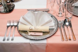
The kitchen and dining area seem to be popular sites for silly staging tactics. Nothing screams “staged home” like a formally set dining room table, especially when the charger plates are filled with dried lentils.
What would you think if you found baking accessories strategically scattered around the kitchen island beside a tray of dusty, painted plaster cookies? (Yes, it’s actually been done!)
Think uncluttered. There is no need for these details and they only distract buyers from viewing the individual rooms as their own home. A fruit bowl on the counter or a vase of flowers on the dining room table is how most people live. Less really is more.
Be sure to check back here on Friday when I divulge silly staging tricks that I have seen over and over again in overly staged bedrooms.
In the meantime, please help make this series even more entertaining by adding your own comments about silly staging tricks you have seen!

Debra Gould, The Staging Diva®
President, Six Elements Home Staging
Home Staging expert Debra Gould also known as The Staging Diva knows how to make money as a home stager and has taught over 7000 other men and women to do the same. She is president of Six Elements Inc., an internationally recognized home staging company that is frequently profiled in the media in both the US and Canada. Debra Gould developed the Staging Diva Home Staging Business Training Program to create opportunities for others to grow their own profitable home staging, real estate enhancement businesses.


Hi Debra,
Are you against all types of vignettes when staging a house?
Great question Kristy!
I’m actually in favor of vignettes, I just think they have to be subtle.
For example, an arm chair in a corner beside a small table that has a reading lamp and a book beside it, perhaps a nice accent cushion on the chair that picks up some color from the art on the wall.
It’s a vignette to create the right ambiance for a perspective buyer to come in and think, “what a great place to sit and read the morning paper, or curl up with a book on a rainy afternoon”.
What I don’t want them to think is, “that’s ridiculous no one would have that in their home.”