 Are you putting off your home staging career because you freeze up at the thought of making recommendations when you get to your first staging consultation?
I want to prove to you that if you’re considering a career as a home stager, you already have all the decorating talent you need to become a successful home stager.
The truth is, if you have a natural talent for decorating, you’ll always know what to do to improve the way the house shows.
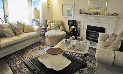
Study the photo here of this very busy living room. Think about what you would recommend your clients do with a space like this and add your own comment to this post with your staging advice for this living room.
I’ll share my own observations in an upcoming post but in the meantime please share your own recommendations by leaving a comment!
Want More Home Staging Design Ideas?
You can always bone up on design for home staging with the Staging Diva Ultimate Design Guide: Home Staging Tips, Tricks and Floor Plans.
In this thorough guide, I take you through each and every space in a home offering my best staging advice, complete with before and after photos from my own projects and accompanying floor plans.


This busy living room needs to have it decluttered with the little pieces of furniture removed. Also the black square piece should not be their,either. I think the room should have the fireplace as the focal point. Then the couch and love seat should be set in a way that it shows off the fireplace. So I would probably move the sofa up in the middle more and the loveseat shouldn’t be at an angle so put it where it is but straighten it. I would move the coffee table so it can be used by the loveseat and sofa. I would move the round chair away from wall a little more and put a floor lammp beside it. I also would g3et a smaller lamp for end tables.
Where to start!? First, get rid of most of that oversized furniture! It is all so heavy and makes it feel so small. Keep the couch if the budget is an issue and find another couple (one? – can’t tell the true size of the room) of “lighter” interesting accent chairs to create a conversation area. Lose most of the artwork and “stuff”. Next, color… there is NONE. Where is the focal point… it is lost in all that blah cream. Are you really enticed to go into this room? I don’t think so. Use art to really punch up that fireplace. Who are you appealing to? Color and pattern throughout the room really depend on answering that question. Obviously, ditch all those bland pillows. Third, those windows are begging us to allow the view from the outside in but we can’t because of sofa placement. What an asset in this room! Move that couch and frame them with something (again, target market would dictate this decision) of color/texture. Can’t really tell what is going on under that carpet but the current one really doesn’t appeal to a younger buyer. Regardless of target market, wouldn’t some oversized mirrors flanking the fireplace really bounce that light around? Talk about energy!
I would replace the art, as stated, over the sofa. Pull two or three key colors out of the art and add pillows in those colors to the sofa. These colors make a bright and happy statement.
For a more decorative touch, I would add a long dish on the coffee table, long to mimic the shape of the coffee table. Add something of interest in the dish. One strong design statment mimics the look of a glossy magazine.
Kathy, great suggestions. Thanks for sharing!
Clear off the clutter on the mantle and create a focal point with something hung centered above it. Arrange furniture in an L or C shape around fireplace. Add small coffee table. Lighter colored rug. Declutter around the large window. Maybe add a nice tree in a pot in the corner and I would change the paint color to a slightly darker neutral.
Excellent suggestions Linda! Are you a professional home stager?