 So many people fret over how a color wheel works. They think this “knowledge” will make it easier to choose colors for their next decorating or home staging project.
Color inspiration comes easily from nature.
Taking a walk in a garden, by the beach or through a forest, you can’t help but get inspired by nature’s gifts. The subtle play of one tone beside the next. The gorgeous contrasts. it’s all there for the taking. It’s the quickest and easiest way to an inspiring color palette, and to know that the colors work together.
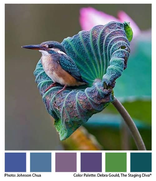
Staging Diva Grad Mary Ann Benoit, of Northern Lights Home Staging found this awesome photo of a hummingbird by Johnson Chua in Focus Magazine on Facebook.
I was so taken with the wonderful colors I decided to fool around with it on my computer and see if I could “sample” some of the colors from his photograph and show how they can make up a color palette for a decorating project.
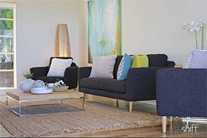 Not long after that, I saw a Facebook post by Staging Diva Grad Adam Luttrell of Shift Property Styling.
By pure serendipity, his latest home staging project in Tasmania is such a wonderful example of the very color palette I had just created from the photo!
I’ve been watching Adam’s business grow in the 9 or so years since he took the Staging Diva Home Staging Business Training Program. I think it’s pretty cool that we were working on similar colors from opposite ends of the planet!
So many beautiful colors where do you stop?
I could have gone on for hours picking more and more colors from Johnson Chua’s photograph. I had to stop myself at these 6 ideas. Now I’m wishing I’d also sampled that brilliant turquoise on the right. And the more subtle pinky-orange just below the bird’s wing.
To be honest, I had forgotten the visceral pleasure I get from playing with color. It lights me up!
Here are two ways you can combine the colors in the palette I’ve created above.

By the way, you might like these combinations for decorating. Plus, you could also use them for your branding.
In a previous article I talked about the importance of choosing a personality for your company. Your choice of color is one of the most important components of this.
 Just as color sets the mood in a room, it also sets a “mood” for how your company or brand is perceived.
That’s where you need to put your marketing hat on and think about your target audience for your home staging, redesign and color consulting services.
I used to design and hand paint floorcloths and home accessories. The Debra Gould Home Collection was featured in books and magazines. This was a great joy to me because I’m an entirely self-taught artist.
And no, I can’t rattle off the theories built into a color wheel. I choose colors purely by instinct.
One thing I learned through trial and error while painting floorcloths, was that groups of three colors worked really well.
Not surprising, groups of three work well in objects on display too. The “rule of three” is one of the many topics I cover in the Staging Diva Ultimate Design Guide: Home Staging Tips, Tricks and Floor Plans.
How do you choose color palettes?
Please share in the comments how you come up with your own color palettes. Do you study color wheel theory or operate more by instinct like I do? There’s no one perfect solution, so I love to learn from you too.

Debra Gould, The Staging Diva®
President, Six Elements Home Staging and Voice of Possibility Group Inc.
Home Staging expert Debra Gould knows how to make money as a home stager and has taught over 9000 students how to do the same. She is the author of several guides including the Staging Diva Ultimate Color Guide: The Easy Way to Pick Color for Home Staging Projects.
So glad you were inspired by the photo! I have been a wildlife biologist for 25 years and have always loved the beautiful colors, textures and patterns in nature. Bringing the outside in is the theme of my business, Northern Lights Home Staging and Design. When I found this photo I loved the color and textures so much I thought it would be a great palette for design. I mainly go by “instinct”. My instinct was keying in on the bright turquoise as the main color, followed by the brilliant green, shades of blue and touch of pink and yellow. I often use photos from animals and plants to develop color palettes if starting from scratch. If working with what someone already has, I use instinct. I have some resource books like the color bible I use to help others select colors they like and go from there. I was inspired by how you took the photo and came up with a palette on the computer and discovered several programs that could do that which seems like a great tool! Obviously they pull out all the colors of the photo and you need to choose which you want to use. Great idea and wondered which program you used? It inspired me to develop my own color palettes from my favorite nature photos. Thank you!
Mary Ann, I tried doing this experiment in PHotoshop but couldn’t figure out how to easily get it to work. Then I switched to Illustrator and it came together nicely.
This exercise and photo also helped me come up with my color palette for my newly redesigned site, DebraGould.com which just relaunched two days ago.
Thanks Debra, you caught me just as I was walking in to Sam’s to buy Photoshop and glad I didn’t! I am exploring some online software for color palettes and will let you know if I find anything amazing. Your new website looks great and definitely captures the “simple is smart” idea.
I love color! My summer art teacher when I was a kid said I was a “colorist” more than an artist…which is why stained glass is such a good fit for me [which is what I do].
But my house also must be a piece of art–art to live in. As an interior designer, I’m pretty much self-taught–recognizing in *many* kinds of design the same basic principles.
So! How do I come up with the colors for a room? First I consider the art that will live there. What is the main color that would show it off to best advantage?–usually one of the colors in the art itself, and usually a lighter shade. What secondary colors from the art piece would enhance the room in other furnishings? What wood tones will harmonize? What other art will fit and not fight with the main piece?
One major point for me is proportion: there can be several secondary colors, but they need to harmonize with the main color. Any secondary or accent color that *contrasts* with the main color should be small in proportion to the main color(s).
So far, that’s a method that has worked for me–but then, my own house is about art, anyway! 🙂 I’m hoping it works well in staging a house, too, even though individual tastes in art are very personal–because we’re looking to sell soon. Wish me well!
Thanks for sharing your approach Ginnie! Wishing you every success in the sale of your home! Have you ever considered home staging to add to your services?
Ginnie, how interesting, that is exactly what I do and I love color (and am also a stained glass artist) as well. I tend to start with the art and design the space around it, using the colors from the art for inspiration.
Mary Ann, glad you two met:)